Alumnir
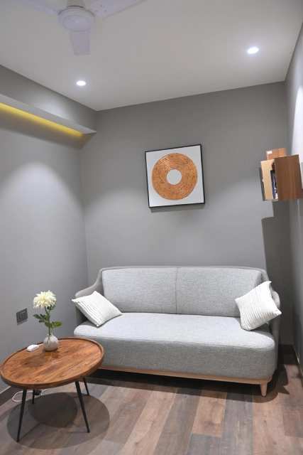
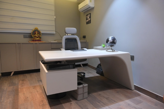
We sat through & discussed what the client needed of the space. When we took the project this place was raw with commercial floor tiles, basic wall putty,etc.Taking it further to the layout plans, with the utility areas like pantry, powder room & office cabin, we came up with the design concept.
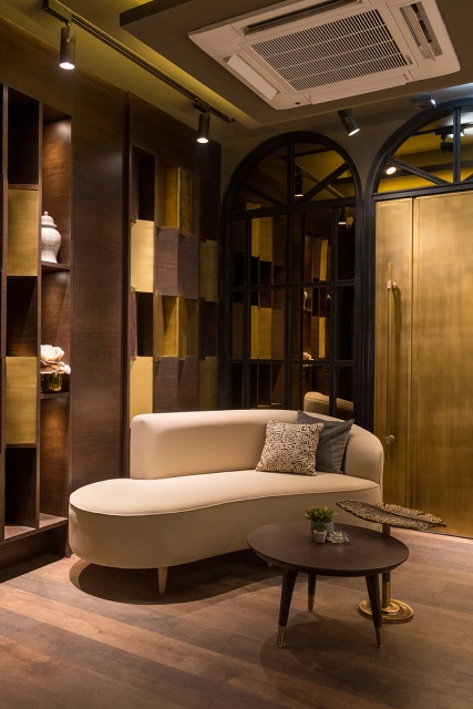
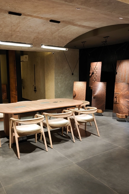
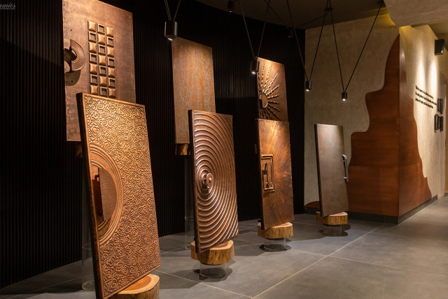
The design approach was a fusion of We designed the display like a gallery with a basic underlying intent to bring about the showcasing of product detail well & reflecting the essence of the product itself, which was natural, raw, yet classy & elegant.
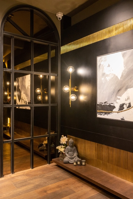
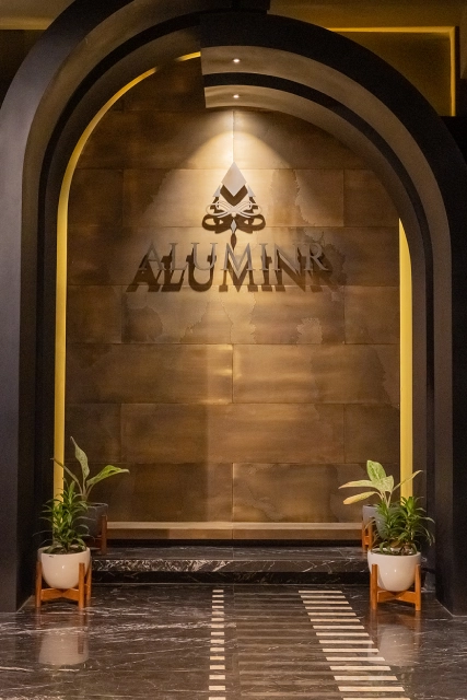
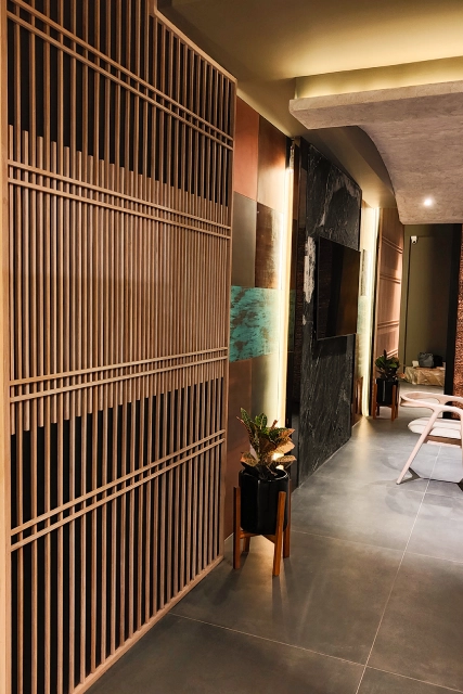
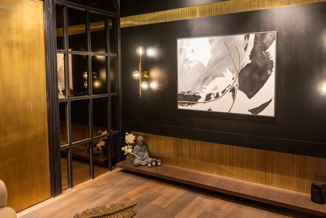
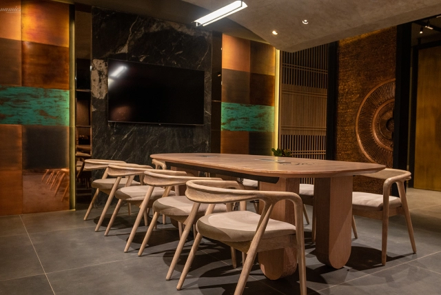
There is a clear usage of natural wood, rustic wall finishes & ceiling, distressed polish on furniture, matt floor tiles, natural stone with semi precious inlay at the entrance & wall claddings.
We wanted to highlight the product well so we designed thoughtful placements,utilising their raw material in the form wall panelings & furniture as well. The idea was to demonstrate the multi-dimensional creative aspect of the product to create an impact for the client’s product goals.
The design perspective was to resonate with the product’s authentic, sophisticated feel & amalgamate our design philosophy as one.
